RESILIENCE
RESILIENCE


Design For Accessibility


(Squint you might be able to read it better)


For videos, often times companies don't realize that people who can't hear won't be able to interact with it all!


This billboard mimics how hard it can be for people with visual disabilities to read on ads, by using shades of colours that are only legible at certain times of the day.


What is visible at dusk.
What is visible at night.
What is visible in the day.
By partnering with IKEA, the campaign is able to push further into packaging. IKEA uses product names that are legible to people with dyslexia. CNIB allows for it to be read and used by people with physical disabilities and visual disabilities, that can also be re-used for other purposes including a matt for homeless people to lay on.
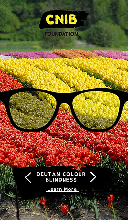
What better way to have ordinary people understand the struggles that people with disabilities go through on a day to day basis, than having them experience it first hand?